
Ehem, hi.
I checked, and my last post was published in June last year. More than a year ago. Not exactly the kind of consistency that builds a loyal readership.
To be honest, it hasn’t exactly felt like the easiest year to write. Not just personally, but collectively. It feels like every week brings another headline, another uncertainty, another reason to feel a little more exhausted than before. Perhaps that’s true everywhere, but it certainly feels true here in Indonesia.
And yet, the thing that finally convinced me to open a blank page again was not a profound life event, a major realization, or a carefully planned writing routine.
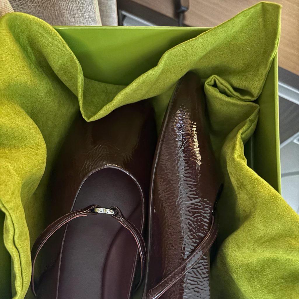
A few days ago, something I ordered finally arrived. It was a shoe box. A pair of plum ballet flats nestled in a deep olive-green box, accompanied by a velvet dust bag.
Looking at them, I had the distinct feeling that someone, somewhere, had made a series of very specific color decisions.
I would like them to know that their efforts did not go unnoticed.
It reminded me of a story my friend still tease me about to this day.
I was waiting for a Gojek ride after work when the driver called and asked the usual question:
“Mbak pakai baju warna apa?”
Without thinking, I replied,
“Baju warna salmon, ya, Pak.”
The moment I hung up, a few colleagues started laughing.
“Mana tahu driver Gojek warna salmon.”
To be fair, they had a point. Most people would have simply said pink.
But colors carry references, textures, and associations. Not because I know anything particularly sophisticated about them, but because “pink” and “salmon” feel different in my head, even if they belong to the same family.
I suspect this is why certain color pairings stay with me.
The first is pink and green. Put them together and there’s a good chance I’ll like it. I do have favorites, though: rosewood, ballerina, or Persian pink with pine or fern green. I especially love seeing them on small things—trinkets, bracelets, stickers, postcards, and other completely non-essential items that somehow become very essential once they’re pretty enough.
The second is blue and brown. This one has a stronger grip on me because it extends to clothing. Give me a slate or muted slate blue paired with an ash or saddle brown like something borrowed from an old book cover, I’ll probably be tempted.
And now, I think plum and olive have joined the list.
In a year that has often felt heavy, there was something comforting about finding pleasure in a color combination. Appreciating a beautiful package. Finding the right word for a shade. Moments.
And sometimes, that’s reason enough to write again.